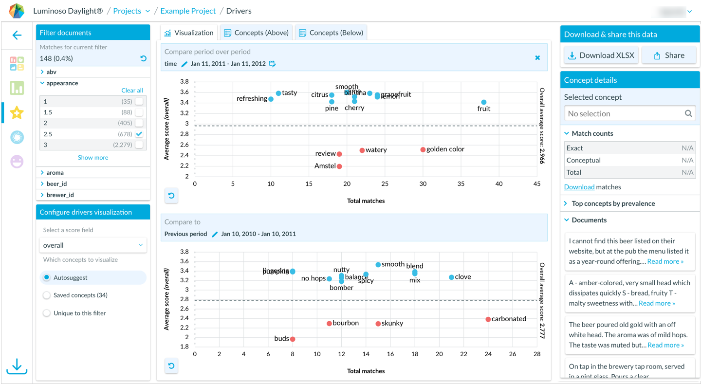
Access Drivers: Trend Analysis, a premium feature that uses comparative scatterplots to:
Discover directional changes in drivers over time
Compare period over period, or year over year
Decide exactly which concepts to visualize for easy comparison
Consult a concept list with key metrics
If you share a direct URL to a project’s Drivers scatterplot, the URL reflects:
Any filters you selected
The score field you selected
Whether concepts are saved or autoselected
The top 15 concepts by average score ascending
Want to request access to the premium feature? Please contact your Customer Success Manager.
To compare drivers over time
Open Daylight and select the Drivers feature.
Select an option from the Select a score field menu.
Choose Autosuggest or Saved concepts from the Which concepts to visualize section. Concepts that strongly influence your score are autosuggested.
Click Select date field to compare periods and select your desired date field from the menu. The visualization splits into two scatterplots. The top scatterplot automatically displays the full date range for the filter you applied.
Refine the date range in the top scatterplot to a narrow interval. The bottom scatterplot responds and displays the previous period or year-over-year. Each scatterplot displays the most relevant autosuggested or saved concepts for that period of time.